Brand design for Engineering Consultants

Be there or B Squared
In 2025, we partnered with a Newton Abbot–based engineering consultancy, B Squared, to develop a distinctive brand identity for their new business venture. Lewis and Josh approached BOYD Creative with a strong initial concept for their logo, which we evolved into a comprehensive visual identity.
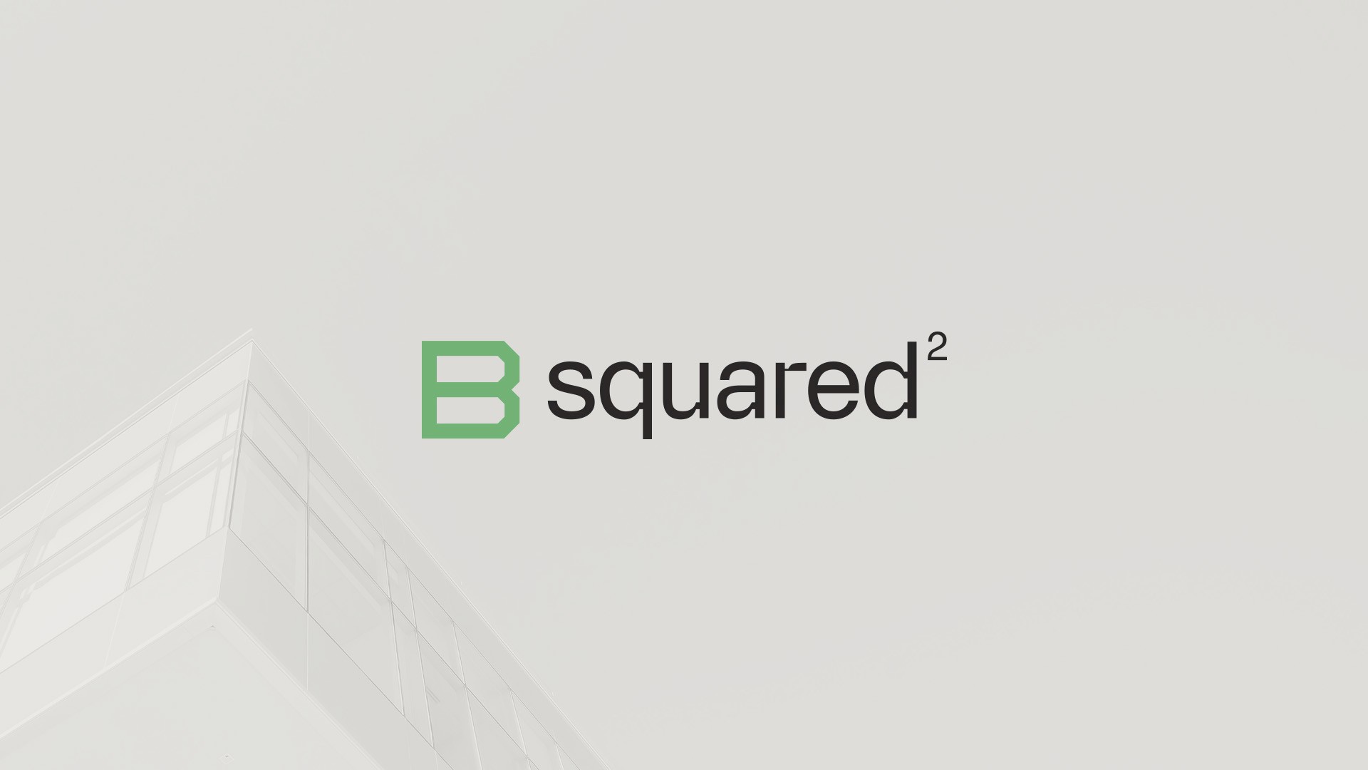
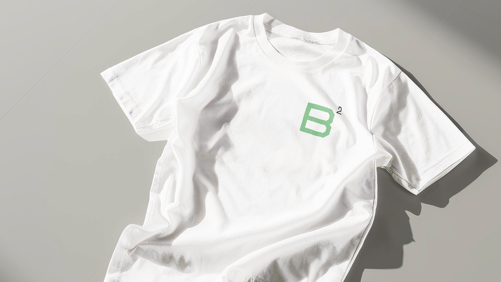
At the heart of the brand is a bold “B” icon, set within a square frame and constructed from clean, straight lines—evoking the structured precision of architectural blueprints. A square root of 2 symbol sits above the “B,” a simple yet impactful nod to the mathematical concept of “squared” that gives the brand its name.
The visual language is grounded in a soft, neutral palette inspired by natural building materials, accented with varied shades of green to reflect a forward-thinking, eco-conscious approach to construction. Paired with a geometric display typeface, the brand identity delivers clarity, consistency, and purpose—giving B Squared the tools it needs to launch with confidence.